

Responsive UX design for mobile apps and websites gives users intuitive experiences. Such UX design focuses on accessibility and solution effectiveness to enhance the mobile interactivity of your digital resource. Please note that mobile app and web users love engaging, easy-to-use apps or websites, as they offer smooth navigation and appealing interfaces.
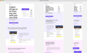
Moreover, responsive websites quickly adapt to different screen sizes based on visitors’ viewports. They load faster and without distortion.
But how do you achieve optimal mobile user experience? What parameters to keep in mind when hiring UX designer for your new project? Here are seven steps to help position your website and apps for optimal mobile use.
Responsive UX Design: What It Is and Why It Matters
Before examining the seven steps to optimizing your apps and website for mobile use, let’s define responsive UX. A responsive UX design is a graphic user interface (GUI) approach for creating content that adjusts smoothly on various screen sizes. Designers size components in relative units and apply media queries to ensure consistency across different gadgets.
Overall, website developers and owners must understand user needs and expectations when interacting with their sites. But how large is the market for mobile use? Statistics reveal that the number of mobile device users will hit 6.9 billion in 2023, comprising 75% of the human population. Here are the reasons to use responsive UX design agency in your websites and apps.
Shoppers Use Mobile Devices Inside Stores
The number of online shoppers using their Android and iOS devices to shop has surpassed desktop shoppers. Therefore, using a responsive UX design lets you access over 60% of online buyers.
Higher Rankings and Increased Traffic
Optimizing responsive UX increases your website’s rankings. Google uses mobile responsiveness as a primary ranking factor. Thus, websites with excellent mobile responsiveness rank higher than those lacking it A higher ranking means more people can access your site in organic searches.
Please note that about 29% of searchers click on the top results in Google. Another 16% click on the second result, while a mere 11% will click on the third result.
Lower Maintenance Needs
Responsive design saves you the cost of maintaining two websites to serve your mobile and desktop users. Keeping two separate sites requires you to have two content strategies, two administrative interfaces, and possibly two design teams. All these things waste your money, time, and effort.
Faster Page Loading and Reduced Bounce Rate
Most mobile users have short attention spans. Studies reveal that these users abandon pages that take over 3 seconds to load. This abandonment increases bounce rates and reduces potential sales. Fortunately, responsive user design solves this challenge by boosting page loading speed.
7 Steps for an Optimal Mobile User Experience
You are abreast of how responsive design benefits your website. But how do you implement it? Here are seven steps to optimizing your website and applications for mobile use.
Improve Accessibility for Primary Actions
Accessibility makes your website or applications more usable by people. Therefore, improving accessibility for primary actions is necessary for optimizing mobile user experience.
Create Finger-friendly Buttons
Your design should focus on how users interact with an app or website’s touch controls. Using small control points often causes accidental taps. You can understand this idea better by thinking about the adverts you see on your mobile device. Mostly, their ads are small, hard to spot, and difficult to reach. To fix this mess, create controls that measure between 10 and 12 mm (40px) for accurate finger tapping.
Ensure Continuity and Consistency
It would be best to guarantee consistency and continuity to improve mobile user experience. Your design should allow users to continue where they left off and switch conveniently between desktop and mobile devices. Employ these strategies to achieve this goal:
- Keep content consistent between different screens. If you create separate versions, don’t compromise user trust with glaring changes.
- Maintain continuity to let users track orders on desktops as quickly as on mobiles.
- When creating different versions, allow users to switch between mobile and desktop formats.
Deal With Font Size and Type
Different fonts create varying emotions that provide easy readability. Using the wrong font can compromise your overall design. Keep these tactics when handling font matters.
- Typeface
Select typefaces that blend perfectly in different sizes and weights to preserve readability and usability in all sizes.
- Size
Utilize large, legible sizes to let readers read conveniently from a distance without zooming their screens. Apple and Google recommend using at least ~11 points.
- Color Contrast
Lastly, optimize contrast checkers to avoid color challenges between backgrounds and fonts. You may also incorporate the 60-30-10 rule that refers to an ideal proportion for attaining a balance among various colors.
Deal With Long-scroll Issues
Sometimes, long scrolling helps users focus while reading text blocks. But other times, excessive scrolling kills user interest and promotes frustration. So, shorten your screens using cards with ‘tap to expand’ features or by breaking up tasks into smaller screens.
Alternatively, use horizontal screens to browse product catalogs or display data on extended visual areas that don’t fit on screens. If more content is available, give visual indications and specify the scrolling directions.
Simplify Navigation
Many mobile users utilize one hand. Therefore, simplify their navigation by:
- Aiming for navigation that is easy to use and learn.
- Creating 30×30-pixel/7–10-mm buttons/tabs.
- Using full-screen navigation menus, minimum navigation levels, and clear labeling. These should include tabs, icons, and graphics.
- Prioritizing frequently used items at the top and considering how much users can conveniently access them.
- Giving short-key access to features.
- Not mixing navigation patterns.
- Clearly showing links and indicating when users have activated them.
- Allowing one primary action per screen.
Give Sufficient Spacing
Lastly, optimize the mobile user experience by giving sufficient spacing. Don’t use small texts or less space just because you have smaller screens. Don’t let texts or other elements overlap. Instead, boost legibility through increased line height and element spacing.
Responsive Design Is a Path to Success
Responsive UX benefits mobile app and website users. It also benefits designers and website or app owners. This post examined these details and shared actionable steps to boost user experience for mobile user experience. We hope you will use these valuable insights to give your customers the best experience interacting with your websites and apps.