There aren’t very many changes a company can make that will redefine its brand overnight. Launching a new logo design is one of them, though. Ditching an established logo in favor of a new and unfamiliar one is a major choice for any company. That’s exactly what AutoAnything did when they unveiled a revamped design and introduced a new branding strategy. The retailer’s home page offers a few clues about the changes, but the biggest shift is evidenced in the increased emphasis on customer service. In addition to this, AutoAnything continues to expand its inventory, proving its commitment to offering accessories and parts for practically every auto on the planet.
A Design That Stands Out
The design of the new logo may not seem flashy at first glance — and it isn’t. In fact, it’s not even that different from the original logo that the brand had a little while ago. It features the same bold lettering, announcing the name — AutoAnything — but now, those words are in a bright red and blue typeface. If the colors strike you as patriotic, that’s no mistake. AutoAnything is proud to work with manufacturers that ship directly from U.S. warehouses, so the red and blue colors are a subtle nod to this commitment.
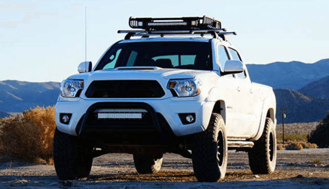
Of course, the colors aren’t the biggest change. The addition of an illustrated outline of a truck caught customers’ attention immediately. AutoAnything has always catered to truck drivers, but this small detail solidifies the company’s reputation as the top dealer for truck parts, accessories, and alterations. If you’re looking for standard truck accessories like folding tonneau covers, you’ll find them at AutoAnything — and you can easily filter products based on your truck’s year, make, and model to ensure that you find the right product every single time.
Establishing a Brand
The new AutoAnything logo coincides with the rollout of more customer service features, but underneath it all, nothing has really changed. AutoAnything has been the most consistent company in the auto retail game since its founding in 1979. It started as a family business, and it’s still a family business, operating from its California headquarters. The new logo doesn’t represent an effort to change this brand. Rather, it reflects a push to establish the brand by highlighting the characteristics that matter most — family, trucks, and a commitment to the U.S. economy. These have always been the AutoAnything values, and they still are.
Many dedicated customers shop at AutoAnything because of these values, but most are simply lured by low prices. If you’re shopping for rooftop tents, for example, you can find the best selection and the best prices at the AutoAnything online store. Rest assured that the brand’s new logo won’t change the great value and fast shipping that customers have come to know and love. Whether you drive a truck, a Jeep, or a sedan, you’ll find the best assortment of products in the AutoAnything inventory. A new logo doesn’t change the great experience buyers can expect.